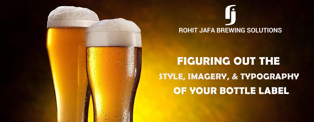
Hello Folks! This is the second part of our post on beer label design. If you haven’t checked the first post yet, you can find it here. In this post, we take a look at the typography, design, colours, and style of beer labels.
What’s in a Colour?
One of the best ways to communicate the personality of your brand quickly is to use the right colours. Several scientific studies state that each colour evokes a specific emotion. For instance, the colour “red” triggers hunger. This is why most fast-food brands use red in their design.
Beer Bottle Colours
Before you decide on the colours to use on your beer label, you have to think about the colour of your:
- Beer
- Bottle
When it comes to beer bottles, there are three popular colour choices – green, brown and clear. Brown bottles filter out UV rays (along with regular light), thereby protecting your beer from going skunky. If you’re brewing hoppy beers, then brown bottles work best for you. On the other hand, if your brew has little to no hops, then you may choose green or clear bottles.
Colours for Your Beer Label
Once you have figured out the colour of your bottle, the next step is to decide on the colours to use on the label. Here are some common practices:
- Green bottles are paired with black and white labels, along with a dash of red.
- Brown bottles offer a neutral background for the label and work with all colours. Some of the common colours you can spot are – red, gold, and orange.
- Clear bottles generally have label colours that are same or directly contrasting the brew.
- Another standard practice is to use colours that reflect the particular style of the beer. For instance, ambers use amber lablels, red ales use red labels, and stouts use dark brown labels.
While these are general rules, there’s no reason to stick to them. You can opt for an “out-of-the-box” colour scheme to make your brand stand out.
Typography
Just like the colour of the label, the fonts you use on your label have a direct impact on the personality of your brand. Choose script fonts or Serif fonts if you’re going for a classic look. Sans-serif fonts work better if you want to make your beer look modern and contemporary.
While you may be tempted to go with a crazy, fun font, remember that readability is the ultimate aim. You don’t want your customers to have a hard time trying to figure out what’s written on the label.
Style
Here’s the general rule of thumb followed by traditional beer brands – one prominent colour on the label, a large visible beer name, and some abstract images or logo of the brand to add visual interest.
Today, with the rise in popularity of craft beers, label design has transitioned into an art form. There are plenty of creative labels out there – from hand-drawn masterpieces to cartoon-like illustrations, extreme minimalism to photographs, there are so many styles on the market today.
Here’s a quick tip to help you find the right style for your beer label – keep your target audience in mind. If you’re targeting the millennial crowd with experimental flavours, then an outlandish or funky label design will work for you.
On the other hand, if you’re targeting wider demographic, spanning generations, then a minimal, classic design may be better for you.
Imagery
Once you have nailed the style, the next step is to focus on the images you want on your label. Once again, here you have to focus on your USP – what makes your brand stand out from the rest?
Do you use certain ingredients? Showcase images of these different ingredients on your label. Do you use a particular brewing technique? Showcase it with creative clip-arts. Or do you have a clever name for your beer? Showcase it visually.
Words
Remember that the words you print on the label are also part of the design. Do you want to reach out to specific customers, say IPA lovers? Then, make sure you include the word “IPA” on the label and highlight it out.
Here is a list of a few common beer keywords to give you some inspiration. Mix and match these words to highlight your brew.
| Adventurous | Aged | American | Artisanal |
|---|---|---|---|
| Barrel | Belgian | Bitter | Blonde |
| Creamy | Crisp | Dark | Dry |
| English | Fruity | Full-bodied | Full-flavoured |
| Handcrafted | Hearty | Hoppy | Homebrewed |
| Layered | Malty | Micro-brewed | Mellow |
| Organic | Robust | Rich | Sharp |
| Smoky | Smooth | Thick | Traditional |
Don’t Forget the Fine Print
While it’s essential to make your beer label stand out, you cannot skip the basics and other legal requirements. Here are a few elements that are a must:
- Net Contents – This specifies how much beer is in the bottle like 350ml and so on.
- Alcohol Content – You have to specify the alcohol level in your brew.
- Beer Class and Type – This indicates the type of brew.
- Manufacturing company name and address – So, that your fans can know where to reach you.
- Manufacturing date and Best before date.
- Contact number or customer service mail id.
Final Thoughts – Stand Out with a Stunning Label Design
Remember that the label is more than a legal requirement. It’s your brand ambassador. And, one of the main elements of a successful beer label design is – Consistency. Your label has to match the rest of your brand image. This is essential if you want your customers to be able to identify your brand easily.
Hope this two-part series helps you find the right labels for your craft beer. Stay tuned for more such info on promoting and marketing your craft brews. And, sign up for your newsletter for the latest info on the expanding world of craft breweries in India.
And, if you need any help in setting up or sourcing additional brewing equipment for your microbrewery in India, all you need to do is drop us a mail. And, our team will get in touch with you as early as possible.